A building by the hill
At the beginning of 2009 the Municipality of Celldomolk launched a competition for designing a centre for information technology and education in the geological history of Kemenesalja. Laszlo Foldes and his colleagues won the competition with this clear-cut design and structure of a tower-shaped building.
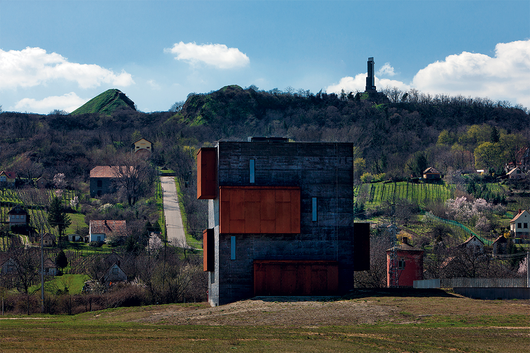
Essentially two different dispositions emerge when handling a place of outstanding geological and industrial background: the first is furtiveness, resemblance to landscape through the application of natural elements of landscape architecture. This option was chosen by Tamas Levai and his team as they designed a nice entrance (referring to Tadao Ando’s Chichu Museum). Laszlo Foldes’s team responded to the challenge of the environment in a different way: they made a strong gesture, an actual building. What is more, it was a tower, a vertical sign that clearly separates the subject of observation from its object (building and nature), and at the same time fixes the observer’s place, giving the you are here point: Man and Tower watching the hill together.

Tower
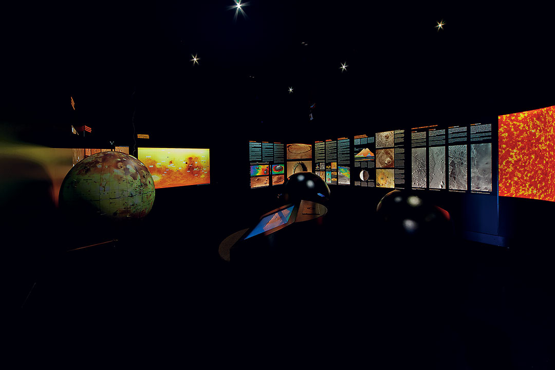
The archetype of the tower provokes plenty of associations: Wright gives the basic formula of the vertically spiral exhibition space in his Guggenheim Museum in New York. Foldes Architects enrich the experience of space, the continuous passage up and down with stations stopping the visitor level by level in exhibition spaces of certain characteristics. Moreover, they reverse the direction of Wright’s spiral: in New York the path begins at the top (where the visitor arrives in the elevator) offering a slowly descending visit leading to the exit, while in the Volcano Park building we rise from the lowered, −1 underground-level entrance to the zenith: the top viewpoint revealing the Sag hill.
Reversing the direction this way might be disputed, as the small size of the concluding space, the objectivity of the sight (still?) does not necessarily culminate in a cathartic zenith despite the experience and adventure underwent during the visit. But the direction is justified by the position of the tower, its observatory-like character: not only are the collection and the introversion part of the exhibition, but the outside as well, the hill itself. This explains and verifies this final emphasis on the eye watching the hill. Again, an architectural archetype is revived in this idea: the world of observatories, that of an elated regard. Patrick Geddes applies this solution when (re)constructing the exhibition and the lookout tower in Edinborough (1892), this archetype of local history exhibitions. The top observatory level got an emphasized role above the exhibition spaces showing the history of the city: from the tallest building of Edinborough at the time, the visitors could observe their, otherwise too closely experienced, city life in a slightly estranged, but very pleasant way.

The Well of Pleasure
This is, most likely, the key idea of the tower in Celldomolk: its spaces, the tactile quality of its materials, and the associations produced add a visceral layer to the visit. Although when distinguishing the two possible dispositions, the landscape or the building, we clearly stated that Foldes Architects opted firmly for the second, we can discern architectural and natural associations in their design method, and in the generous attitude of this abstract architectural world. It strongly evokes the images of wells, chimneys, even a huge periscope, but we can also associate it with an immense, unknown industrial structure as well – having in mind the history of the area when the minerals were dug out here. Strong associations to nature follow: cave, light, depth, introduction a new subject – the volcano, not through didactics, nor through formal or direct allusions, but with fine and generous gestures.
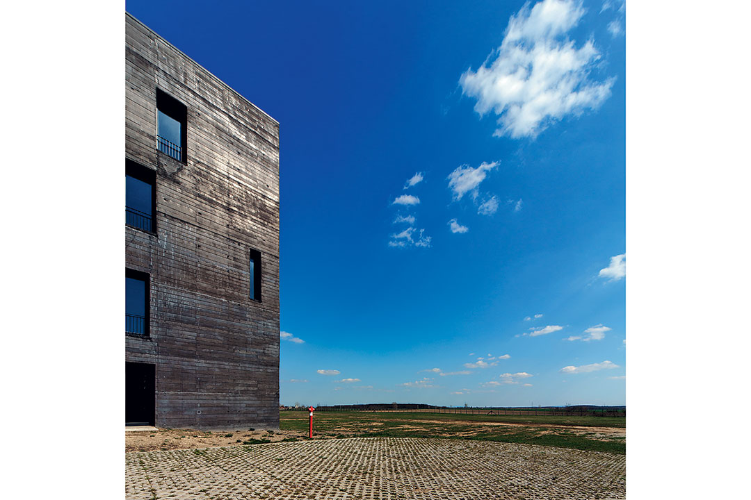
This is the real beauty of the building: it offers the pleasure of space in a way that the visitor can freely lance his imagination. My favourite and strongest association comes from Jules Verne: this house would be a senior geologist’s construction where staircase structures curve in an autonomous disorder and the observatory is obviously infinite, and is directed obviously towards the centre of the Earth. The details all enhance this experience: riveted (like) rusted metal sheets, functional banisters, light streaming in over the top, tactile surface structures.

Far and Near
My only infinitesimal reservation is also related, astonishingly, to this formation of details: this carefully thought-out fineness of the details seems to be almost over-refined and over-educated, too urban for this building at the end of the World (in space and in time), for this half industrial, half natural world. In the long term how will this building stand the desolate loneliness of industrial monuments or lighthouses? Is it not too professional and solicitous compared with the melancholy and silence of the place, of the basic gesture? (On the other hand, this same point of view reveals a virtue of the building: its connection to the ground. The entrance level is composed merely of landscape architectural elements: extremely simple wall-land meetings.)
In conclusion, it is the delight of successive wonders that dilutes the confusion caused by this sophisticated language. The excellence of detail design and the professionalism verifies this doubted tone. Nevertheless, the primary experience still remains visceral: it is not only our educated eyes, but our childhood self that is constantly challenged by the adventure of visiting the spaces, the sequence of new sceneries, the physical experience of on-in-under or of forward-backward, offering the sincere delight of wonder.